Having acquainted with
The ABCs of Machine Learning, its time to do some data exploration to understand the nature of data to graduate to the next level.
After we acquire data, the immediate next step would be to make sense of the data, quickly. This step would be of paramount importance as doing this right would help in saving lots of time while we build model/draw conclusion.
Data Set
The data that we are going to explore is sourced from
here.
Lets get started.
As
defined, the data was extracted from the 1974 Motor Trend US magazine, and comprises fuel consumption and 10 aspects of automobile design and performance for 32 automobiles (1973–74 models).
I am using
R to explore the data. Please feel free to use tool of your choice for data exploration.
Quick Tip: As the data is available in csv format, Microsoft Excel would also help us in doing the data exploration.
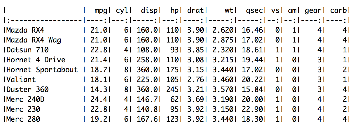
A quick look at (part) of what is inside the data set.
Here is the metadata for the data set.
| Variable Name |
Description |
Variable Type |
| mpg |
Miles/(US) gallon |
Quantitative (Continuous) |
| cyl |
Number of cylinders |
Qualitative (Nominal)* |
| disp |
Displacement (cu.in.) |
Quantitative (Continuous) |
| hp |
Gross horsepower |
Quantitative (Continuous) |
| drat |
Rear axle ratio |
Quantitative (Continuous) |
| wt |
Weight (1000 lbs) |
Quantitative (Continuous) |
| qsec |
1/4 mile time |
Quantitative (Continuous) |
| vs |
V Engine/S Engine (0=V, 1=S) |
Qualitative (Nominal) |
| am |
Transmission (0 = automatic, 1 = manual) |
Qualitative (Nominal) |
| gear |
Number of forward gears |
Qualitative (Nominal) |
| carb |
Number of carburetors |
Qualitative (Nominal) |
* Depending on the analysis that we do using "cyl" this can be classified as Quantitative (Discrete) too.
I have also mapped the variable name and description with the variable type. Please have a quick look to review the same. If there are any questions, please ask them in the comments section.
After we skim through the metadata and understand the variable properties, next step is to get descriptive statistics on the data set. Descriptive Statistics include frequencies (counts), ranks, measures of central tendency (e.g., mean, median and mode), and measures of variability (e.g., range and standard deviation). These help in developing good and quick understanding of the data.
Remember we would want to do numeric operations only on the Quantitative Variables even though some of the Qualitative Variables that have numeric values (e.g., vs, am, etc)
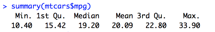
Descriptive Statistics on "mpg"
 |
| Average Miles Per Gallon |
 |
| Median Miles Per Gallon |
 |
| Miles Per Gallon Range |
 |
| Summary Statistics - this captures all of that we calculated earlier at one shot |
Inference on mpg
The mpg (for all the vehicles in the data set) ranges from 10.40 miles per gallon to 33.90 miles per gallon with an average of 20.09 miles per gallon and median 19.20 miles per gallon.
Please note:
summary() in R gives another interesting measure "IQR" (interquartile range) which we ll read about in a future post.
Extending the Descriptive Statistics to the other variables of interest (mpg, weight, gear, am, vs, cyl) in the data set yields us the following.
Inference on mtcars data set
- Total number of cars in the data set - 32
- Distribution of cars based on number of cylinders is as below
| Number of Cylinders |
Number of Cars |
| Four |
11 |
| Six |
7 |
| Eight |
14 |
- Distribution of cars based on number of forward gears is as below
| Number of Forward Gears |
Number of Cars |
| Three |
15 |
| Four |
12 |
| Five |
5 |
- Distribution of cars based on transmission is as below
| Transmission Type |
Number of Cars |
| Automatic |
19 |
| Manual |
13 |
- Distribution of cars based on engine type is as below
| Engine Type |
Number of Cars |
| V-Engine |
18 |
| Straight Engine |
14 |
- Miles Per Gallon ranges between 10.40 mpg to 33.90 mpg
- Weight of the cars range between 1513 lbs to 5424 lbs
Conclusion
We did univariate analysis on the variables in the "mtcars" data set to understand more about the content of the data set. Descriptive Statistics helps us get a good understanding about the data, quickly. We also reinforced our learning about the variable types and we are able to apply different operations for different variable type (e.g., we did not do an average on a Qualitative Variable).
We would continue to do more analysis (involving multiple variables) to make more sense on these data set in the next post.
Gist
A short hand way in R to get descriptive statistics of a data set.
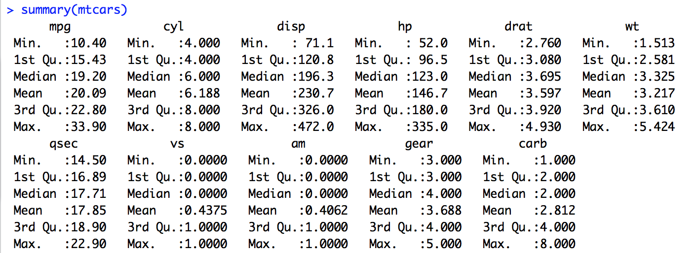 Summary Statistics on "mtcars" data set
Use
summary() command with caution as it treats all the variables that appear to be number as Quantitative irrespective of whether they are Quantitative or not.
Based on the type of the variable,
summary() function gives different output.
- Gives the range, quartiles, median, and mean & number of missing values (if any) for Quantitative Variables
- Gives a table with frequencies & number of missing values (if any) for Categorical Variables
How to handle Qualitative Variables
The results of the
summary() has given Quantitative statistics on Qualitative data - how to handle this?
Change the type of the variable (as a categorical) on the fly and we can compute frequency on the Qualitative variable.
Please Note: The above is an example of changing the type of one variable from the data set. We can also do this treatment as we do preprocessing before we do the descriptive statistics on the data set.
Note #1 : Based on the feedback (in the comments section), I would plan to write a post detailing on these measures (such as mean, range, etc) and explain the significance and on which variable types/when/where these should be used.
Note #2 : I also think of a post on "getting started with R" - if there are takers. Please leave comments if you are interested.
Note #3: Visualizing the data would be another powerful and significant method in exploring data. Please watch out for a post on the same.


