Showing posts with label R. Show all posts

Tuesday, May 9, 2017

Published 10:03 by with 0 comment

Predicting the onset of Diabetes

One of the applications of Machine Learning is to predict likelihood of occurrence of an event from the past data. With our learning from exploring data to testing hypothesis, lets see if we can put together the learning to predict likelihood of onset of diabetes from diagnostic measures.

Data Source

We would be working on Pima Indians Diabetes Data Set from UCI Machine Learning Repository.

Data Set Information

This data set is originally from the National Institute of Diabetes and Digestive and Kidney Diseases. This data set contains diagnostic measures for female patients of at least 21 years of age who belong to Pima Indian Heritage.

Please note: This is a labelled data set.

Number of Records                  :        768
Number of Attributes               :            8

Attribute Information

  1. Number of times pregnant 
  2. Plasma glucose concentration a 2 hours in an oral glucose tolerance test 
  3. Diastolic blood pressure (mm Hg) 
  4. Triceps skin fold thickness (mm) 
  5. 2-Hour serum insulin (mu U/ml) 
  6. Body mass index (weight in kg/(height in m)^2) 
  7. Diabetes pedigree function 
  8. Age (years) 
  9. Class variable (0 or 1)

Taking a quick glance at the data


Please note: The column names are shortened for convenience

The action begins

Now we have sourced the data, using our learning lets start exploring the data.


Summarizing the data set is a simple but powerful step to start understanding the data. As we can see here, there are a few measures with zero values which are biologically impossible (example would be blood pressure). Now this leads us to the next action of handling the missing/invalid data. And its also a good idea to visualize the data.

A Quick Look

As the visuals suggest, Glucose, Blood Pressure, Skin Thickness, Body Mass Index are normally distributed while are Pregnancies, Insulin, DBF, Age exponentially distributed.


Also please have in mind that this visuals are rendered without handling for the missing values. The next step is to handle or treat the data for missing values.

Data Preparation


Missing Values

There are zero value entries for the following measures. We ll impute them with mean value for corresponding measure.

  • Glucose
  • Blood Pressure
  • Skin Thickness
  • Insulin
  • Body Mass Index

Pregnancies

Quick tabulation on this column shows that minimum value being zero (permissible) and maximum value being 17 (still theoretically possible even though this is an outlier).


Just to cross-check the feasibility lets look at the record and check the Age (which is 47). This suggests that this can be possible (at least theoretically).


As the values of Pregnancies seem to be biologically valid, no data handling is needed.

Visualizing Missing Values

Before Imputing

After Imputing
With cleaner data, we are geared up for building models and do the prediction.

Building a model

We try to build a logistic regression model on the data as the Outcome is categorical.


This is easy, isn't it?

The summary gives us interesting information (listed below).

Out of eight features that we have, four stand out to be significant on influencing the person to be diabetic or not (Outcome)

  • Pregnancies
  • Glucose
  • BMI
  • DPF 

Lets looks at the Odds Ratio to see to what extent these features are influencing the Outcome.

Odds Ratio


Each pregnancy is associated with an odds increase of 13.31%
Each unit increase of plasma glucose concentration is associated with an odds increase of 3.80%
An unit increase in BMI increases the odds by 9.76%
For every unit increment in DPF, the odds are up by 137.76%

Prediction


Here comes the interesting part. Having built a model that can predict the likelihood of onset of diabetes, lets try to do some prediction and see how well does this model work.

Here is the confusion matrix from prediction.

Confusion Matrix Visualized


Closing Notes


This model has got an accuracy of 77.73% but the point to be noted here is the model used the same data to do the prediction.

Now a few questions that linger our mind are
Are there any disadvantages in building the model and testing the model on the same data set?
How can we apply this model in a new data with confidence?
How can I ensure this is a good model to predict?
Can I build a better model?
and so on.

Lets try to answer these questions (and more) in the subsequent posts.


P.S.: The complete code that was used for this article is here.

Read More
      edit

Tuesday, April 18, 2017

Published 11:50 by with 0 comment

Lets Explore Data - II

In the previous post we understood the "mtcars" data set and did some univariate analysis to understand the features from the data set.

The objective of this post is to understand how multiple features (aka variables) are related. For example, one might be interested in understanding how weight of the car affects its fuel efficiency.

Correlating Weight of the Car to its Fuel Efficiency

Here is the visual representation of the relationship between weight of the car to its fuel efficiency (mpg).


From this plot, its evident that weight and mpg are inversely related which means lower the weight of the car more the miles per gallon is (i.e. more is the fuel efficiency of the car).

Testing Statistically

To statistically validate this relation and to ensure that this is not by chance, we ll perform correlation test. This can be achieved by cor.test() command in R.


Couple of things to look at the results from Correlation Test is p-value and correlation coefficient.

The smaller the p-value, the more significant the correlation, so here we can be very confident that a correlation exists.

Correlation Coefficient is a number between +1 and −1 calculated so as to represent the linear interdependence of two variables. +1 represents a perfectly linear positive relationship while -1 represents a perfectly linear negative relationship. 0 indicates that the two variables are not correlated.

Inference 

p-value from the above correlation test is a extremely small number which suggests a strong correlation exists.

Correlation Coefficient being -0.87 suggests that the relationship between these two variables are negative (i.e. they are inversely related).

Both the p-value and for suggest that the variation that is observed in the data set is not by chance and there is a interdependence between the variables.

This is a powerful way for understanding correlation between two variables. Now, can we extend this to all the numeric variables in mtcars data set and does it still make sense?

Lets see.

Extension


Well, this chart gives us the relationship between multiple variables but its has a few problems such as it is cluttered and also its redundant (the plots are mirrored across the diagonal).

Lets make it pretty by tweaking this plot a little bit.


This looks much clearer and also gives us the correlation coefficient in the upper half of the plot with text size proportional to the value to improve readability.

We observe stronger negative correlation between the following variable pairs

  • mpg & wt
  • mpg & disp
  • mpg & hp
  • drat & disp

and stronger positive correlation between the following variable pairs

  • disp & wt
  • disp & hp


A Better Visualization? May be!


This visualization gives a sense of which variables are in relation along with their type or relationship (as indicated by the color/correlation coefficient value). This can be an effective tool to communicate the correlation between variables. In this example, the reader can understand quickly that wt & disp are positively correlated while wt & mpg are negatively correlated.

Now a question hits our mind - if the reader is interested in building an understanding of relation between multiple variables (as opposed to just two variables) is there a way to do it?

Visualize correlation of many variables at once

Parallel Coordinate Visualization is the answer.

Parallel Coordinate is an effective visualization technique to visualizing high-dimensional geometry and analyzing multivariate data.


Note: The number of lines correspond in the plot above corresponds to number of cars in each class (highlighted by the color).

This visualization technique gives an awesome way to understand relationship between multiple variables.

With cars categorized based on number of cylinders (4-cyl cars represented by Blue lines, 6-cyl cars by Red lines and 8-cyl cars by Dark Green lines), we are able to explain the relationship between variables much quicker.

For instance - say if you follow the blue lines, its evident that mpg enjoys an inverse relationship with disp, hp & wt. This not only helps us to understand the relationship between different variables/features but also in understanding few interesting facts like cars with four cylinders are fuel efficient in general and higher horse power is obtained by eight-cylinder cars.

We are now equipped with techniques to explore and understand data.

In the next post, lets see if we can use the data to build a model to predict missing variables from similar data.


Read More
      edit

Saturday, February 25, 2017

Published 22:16 by with 0 comment

Lets Explore Data - I(a)

I thought it would be a good idea to visually explain the inferences from the previous post because a picture is worth a thousand words. Visualization is one of the most effective ways to communicate the findings from Data Analytics.

This post would be a shorter one as we are going to visually represent the analysis we did in the previous post.

I am using R to explore the data. Please feel free to use tool of your choice for data exploration.

Descriptive Statistics on "mpg"

Summary Statistics - Miles Per Gallon


The above "box plot" would give the five number statistics (minimum, lower quartile, median, upper quartile, maximum) and Mean.

Distribution of cars based on number of cylinders


Distribution of cars based on number of forward gears


Distribution of cars based on transmission and on engine type


We can also combine different aspects/parameters and chart them together


In the next post, we ll see about multivariate data analysis.
Read More
      edit

Tuesday, February 14, 2017

Published 13:12 by with 0 comment

Lets Explore Data - I

Having acquainted with The ABCs of Machine Learning, its time to do some data exploration to understand the nature of data to graduate to the next level.

After we acquire data, the immediate next step would be to make sense of the data, quickly. This step would be of paramount importance as doing this right would help in saving lots of time while we build model/draw conclusion.

Data Set

The data that we are going to explore is sourced from here.

Lets get started.

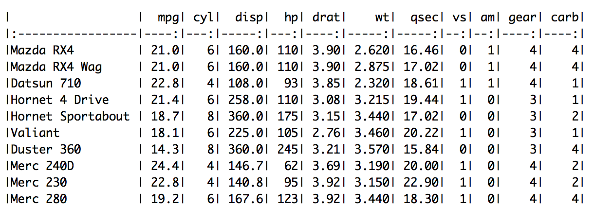
As defined, the data was extracted from the 1974 Motor Trend US magazine, and comprises fuel consumption and 10 aspects of automobile design and performance for 32 automobiles (1973–74 models).

I am using R to explore the data. Please feel free to use tool of your choice for data exploration.

Quick Tip: As the data is available in csv format, Microsoft Excel would also help us in doing the data exploration.

A quick look at (part) of what is inside the data set.

screen-shot-2017-02-08-at-3-54-40-pm

Here is the metadata for the data set.

Variable Name Description Variable Type
mpg Miles/(US) gallon Quantitative (Continuous)
cyl Number of cylinders Qualitative (Nominal)*
disp Displacement (cu.in.) Quantitative (Continuous)
hp Gross horsepower Quantitative (Continuous)
drat Rear axle ratio Quantitative (Continuous)
wt Weight (1000 lbs) Quantitative (Continuous)
qsec 1/4 mile time Quantitative (Continuous)
vs V Engine/S Engine (0=V, 1=S) Qualitative (Nominal)
am Transmission (0 = automatic, 1 = manual) Qualitative (Nominal)
gear Number of forward gears Qualitative (Nominal)
carb Number of carburetors Qualitative (Nominal)


* Depending on the analysis that we do using "cyl" this can be classified as Quantitative (Discrete) too.

I have also mapped the variable name and description with the variable type. Please have a quick look to review the same. If there are any questions, please ask them in the comments section.

After we skim through the metadata and understand the variable properties, next step is to get descriptive statistics on the data set. Descriptive Statistics include frequencies (counts), ranks, measures of central tendency (e.g., mean, median and mode), and measures of variability (e.g., range and standard deviation). These help in developing good and quick understanding of the data.

Remember we would want to do numeric operations only on the Quantitative Variables even though some of the Qualitative Variables that have numeric values (e.g., vs, am, etc)

Descriptive Statistics on "mpg"

Average Miles Per Gallon


Median Miles Per Gallon


Miles Per Gallon Range


screen-shot-2017-02-08-at-5-35-40-pm
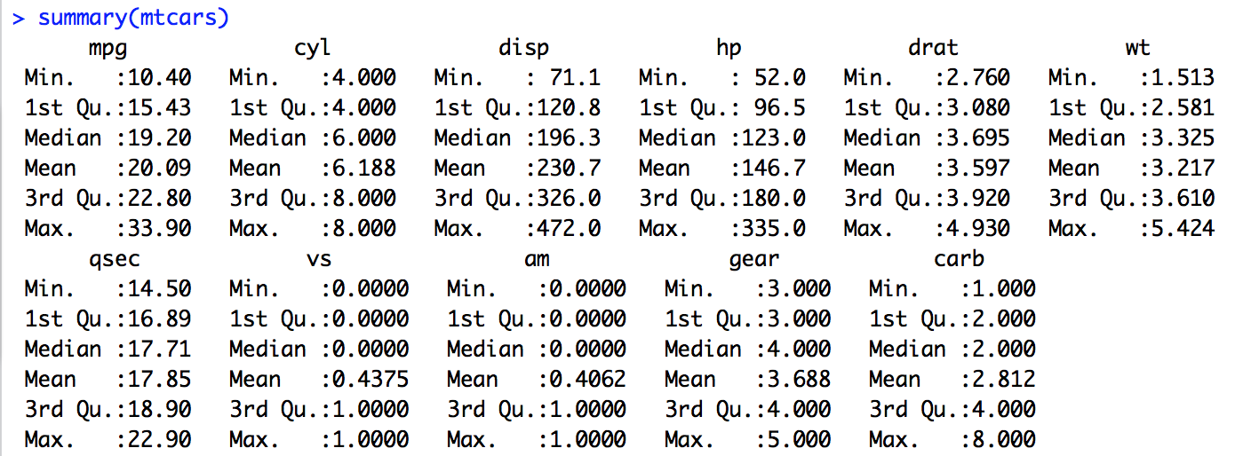
Summary Statistics - this captures all of that we calculated earlier at one shot


Inference on mpg

The mpg (for all the vehicles in the data set) ranges from 10.40 miles per gallon to 33.90 miles per gallon with an average of 20.09 miles per gallon and median 19.20 miles per gallon.

Please note: summary() in R gives another interesting measure "IQR" (interquartile range) which we ll read about in a future post.

Extending the Descriptive Statistics to the other variables of interest (mpg, weight, gear, am, vs, cyl) in the data set yields us the following.

Inference on mtcars data set

  • Total number of cars in the data set - 32
  • Distribution of cars based on number of cylinders is as below
    Number of Cylinders Number of Cars
    Four 11
    Six 7
    Eight 14

  • Distribution of cars based on number of forward gears is as below
    Number of Forward Gears Number of Cars
    Three 15
    Four 12
    Five 5

  • Distribution of cars based on transmission is as below
    Transmission Type Number of Cars
    Automatic 19
    Manual 13

  • Distribution of cars based on engine type is as below
    Engine Type Number of Cars
    V-Engine 18
    Straight Engine 14

  • Miles Per Gallon ranges between 10.40 mpg to 33.90 mpg
  • Weight of the cars range between 1513 lbs to 5424 lbs

Conclusion

We did univariate analysis on the variables in the "mtcars" data set to understand more about the content of the data set. Descriptive Statistics helps us get a good understanding about the data, quickly. We also reinforced our learning about the variable types and we are able to apply different operations for different variable type (e.g., we did not do an average on a Qualitative Variable).

We would continue to do more analysis (involving multiple variables) to make more sense on these data set in the next post.

Gist

A short hand way in R to get descriptive statistics of a data set.

screen-shot-2017-02-08-at-8-43-09-pm
Summary Statistics on "mtcars" data set


Use summary() command with caution as it treats all the variables that appear to be number as Quantitative irrespective of whether they are Quantitative or not.

Based on the type of the variable, summary() function gives different output.
  • Gives the range, quartiles, median, and mean & number of missing values (if any) for Quantitative Variables
  • Gives a table with frequencies & number of missing values (if any) for Categorical Variables

How to handle Qualitative Variables

The results of the summary() has given Quantitative statistics on Qualitative data - how to handle this?

Change the type of the variable (as a categorical) on the fly and we can compute frequency on the Qualitative variable.


Please Note: The above is an example of changing the type of one variable from the data set. We can also do this treatment as we do preprocessing before we do the descriptive statistics on the data set.

Note #1 : Based on the feedback (in the comments section), I would plan to write a post detailing on these measures (such as mean, range, etc) and explain the significance and on which variable types/when/where these should be used.

Note #2 : I also think of a post on "getting started with R" - if there are takers. Please leave comments if you are interested.

Note #3: Visualizing the data would be another powerful and significant method in exploring data. Please watch out for a post on the same.
Read More
      edit

Thursday, February 26, 2015

Published 19:45 by with 0 comment

Multiple Linear Regression using R


Multiple Linear Regression using R

Having understood Simple Linear Regression, we ll move on to understand Multiple Linear Regression. We ll use sample data and R to understand this better.

Building a Regression model with more than one explanatory variable is called a Multiple Linear Regression. 

We ll use the example data to build Multiple Linear Regression model using R and answer a few questions.


Cigarette

Lets list the questions that we would answer post this exercise.
  • Determine a linear regression model equation to represent this data
  • Decide whether the new equation is a "good fit" to represent this data
  • Graphically represent the relation
  • Doing a few predictions

Please note: The data can be downloaded from here.

The "Cigarettes" data set contains 25 observations (each corresponding to different Cigarette Brand) with five variables.

Here is some additional information about the variables.

  1. Variable 1 is the Cigarette Brand Name
  2. Variable 2 corresponds to Tar content in mg
  3. Variable 3 corresponds to Nicotine content in mg
  4. Variable 4 corresponds to weight in g
  5. Variable 5 corresponds to Carbon monoxide content in mg
Now, let us take a moment to understand which are our dependent vs. independent variables. Just to clear some air on these terminologies - an independent variable can be assumed as the cause whereas the dependent variable is the effect. 

In this "Cigarette" data set, we would want to test the effect of Variables 2, 3 & 4 on Variable 5. Hence, Variable 5 would be our dependent variable y and the others are independent variables x1, x2 & x3.

Let us import the data in R and have a look at first few observations.


The next logical step is to 'visualize' the data. Please note: We are excluding the variable 1 which corresponds to the Brand Name.


Building Multiple Linear Regression also is similar to building Simple Linear Regression.


By applying the lm() function on these variables a linear model ll be built.


mlfit <- lm(CO ~ Tar+Nicotine+Weight, data = cigarettes)


Now its time to evaluate the model.


Looking at the R-squared value, this model is indeed a "good fit" (as it tells that ~92% of the variation between y can be explained by the linear relationship between y & x1, x2, x3).

Since there are three independent variables we would also be interested in the variable that influences variability in y the most. Luckily, that is also provided by the summary above.

p-value is the parameter that gives us that information. A low p-value indicates strong evidence against the null hypothesis. We ll discuss more on this later. For now, any variable which has a lower p-value is significantly correlating to the variability in y. Please remember, there can be more than one independent variable with low p-value.

From the above, p-value for Tar is the least (0.000692 and you may also notice the triple asterisk placed after the same indicating its significance).

The linear equation the model has given us is


y = 3.2022 + 0.9626 * x1 - 2.6317 * x2 - 0.1305 * x3


Its time to visualize our model.


Since we have the "good fit" model ready and have visualized, we can go ahead with predicting the CO content in the new fictitious brand (assuming Tar = 12.22 mg, Nicotine = 0.87 mg & Weight = 0.97 g).


Our model predicts the CO content of the fictitious brand to be 12.55 mg.

Complete R code can be found here.


Conclusion

Let us quickly check if we were able to achieve our objectives completely by answering the questions that we had initially.

  • Determine a linear regression model equation to represent this data
  • Yes. We applied the linear regression model and got the mathematical equation to represent this data 
  • Decide whether the new equation is a "good fit" to represent this data
  • Yes. We were able to decide the equation which was a "good fit" based on the R-squared value. Additionally, we also used the p-value parameter for model evaluation 
  • Graphically represent the relation
  • Yes. We did this using R
  • Doing a few predictions
  • Yes. We successfully predicted CO Content for a fictitious brand

Closing Comments
Is this the "best model" that we can fit on the given data?
Interestingly, if you have a close look at what we did today, you ll realize this can be reduced to a "Simple Linear Regression" problem. Only one of the three independent variables can be used to build the model as well predict the CO Content resulting in similar values when all the three were used.

Why don't you try and post your observations/results in the comments?


Read More
      edit