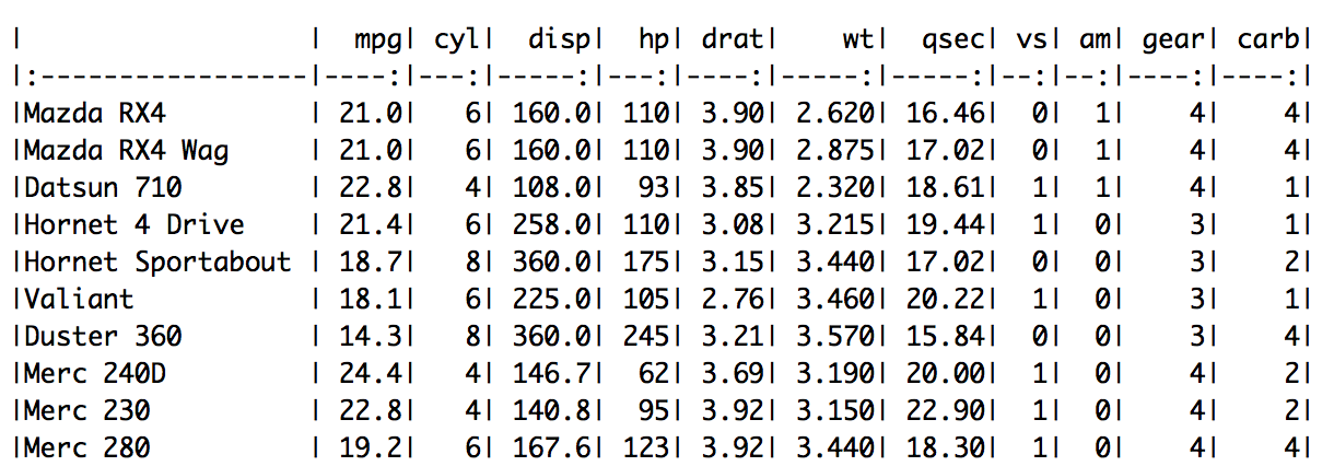
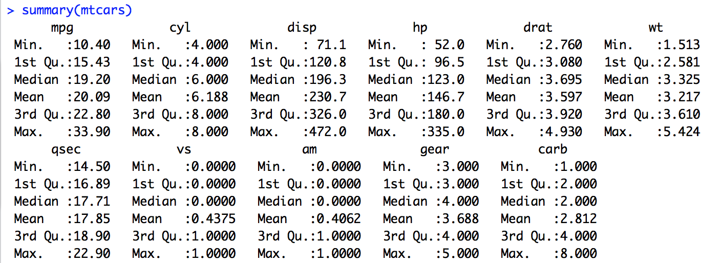
In the previous post we understood the "mtcars" data set and did some univariate analysis to understand the features from the data set.
The objective of this post is to understand how multiple features (aka variables) are related. For example, one might be interested in understanding how weight of the car affects its fuel efficiency.

From this plot, its evident that weight and mpg are inversely related which means lower the weight of the car more the miles per gallon is (i.e. more is the fuel efficiency of the car).

Couple of things to look at the results from Correlation Test is p-value and correlation coefficient.
The smaller the p-value, the more significant the correlation, so here we can be very confident that a correlation exists.
Correlation Coefficient is a number between +1 and −1 calculated so as to represent the linear interdependence of two variables. +1 represents a perfectly linear positive relationship while -1 represents a perfectly linear negative relationship. 0 indicates that the two variables are not correlated.
Correlation Coefficient being -0.87 suggests that the relationship between these two variables are negative (i.e. they are inversely related).
Both the p-value and for suggest that the variation that is observed in the data set is not by chance and there is a interdependence between the variables.
This is a powerful way for understanding correlation between two variables. Now, can we extend this to all the numeric variables in mtcars data set and does it still make sense?
Lets see.

Well, this chart gives us the relationship between multiple variables but its has a few problems such as it is cluttered and also its redundant (the plots are mirrored across the diagonal).
Lets make it pretty by tweaking this plot a little bit.

This looks much clearer and also gives us the correlation coefficient in the upper half of the plot with text size proportional to the value to improve readability.
We observe stronger negative correlation between the following variable pairs
and stronger positive correlation between the following variable pairs

This visualization gives a sense of which variables are in relation along with their type or relationship (as indicated by the color/correlation coefficient value). This can be an effective tool to communicate the correlation between variables. In this example, the reader can understand quickly that wt & disp are positively correlated while wt & mpg are negatively correlated.
Now a question hits our mind - if the reader is interested in building an understanding of relation between multiple variables (as opposed to just two variables) is there a way to do it?
Parallel Coordinate is an effective visualization technique to visualizing high-dimensional geometry and analyzing multivariate data.


Note: The number of lines correspond in the plot above corresponds to number of cars in each class (highlighted by the color).
This visualization technique gives an awesome way to understand relationship between multiple variables.
With cars categorized based on number of cylinders (4-cyl cars represented by Blue lines, 6-cyl cars by Red lines and 8-cyl cars by Dark Green lines), we are able to explain the relationship between variables much quicker.
For instance - say if you follow the blue lines, its evident that mpg enjoys an inverse relationship with disp, hp & wt. This not only helps us to understand the relationship between different variables/features but also in understanding few interesting facts like cars with four cylinders are fuel efficient in general and higher horse power is obtained by eight-cylinder cars.
We are now equipped with techniques to explore and understand data.
In the next post, lets see if we can use the data to build a model to predict missing variables from similar data.
Read More
The objective of this post is to understand how multiple features (aka variables) are related. For example, one might be interested in understanding how weight of the car affects its fuel efficiency.
Correlating Weight of the Car to its Fuel Efficiency
Here is the visual representation of the relationship between weight of the car to its fuel efficiency (mpg).
From this plot, its evident that weight and mpg are inversely related which means lower the weight of the car more the miles per gallon is (i.e. more is the fuel efficiency of the car).
Testing Statistically
To statistically validate this relation and to ensure that this is not by chance, we ll perform correlation test. This can be achieved by cor.test() command in R.
Couple of things to look at the results from Correlation Test is p-value and correlation coefficient.
The smaller the p-value, the more significant the correlation, so here we can be very confident that a correlation exists.
Correlation Coefficient is a number between +1 and −1 calculated so as to represent the linear interdependence of two variables. +1 represents a perfectly linear positive relationship while -1 represents a perfectly linear negative relationship. 0 indicates that the two variables are not correlated.
Inference
p-value from the above correlation test is a extremely small number which suggests a strong correlation exists.Correlation Coefficient being -0.87 suggests that the relationship between these two variables are negative (i.e. they are inversely related).
Both the p-value and for suggest that the variation that is observed in the data set is not by chance and there is a interdependence between the variables.
This is a powerful way for understanding correlation between two variables. Now, can we extend this to all the numeric variables in mtcars data set and does it still make sense?
Lets see.
Extension

Well, this chart gives us the relationship between multiple variables but its has a few problems such as it is cluttered and also its redundant (the plots are mirrored across the diagonal).
Lets make it pretty by tweaking this plot a little bit.

This looks much clearer and also gives us the correlation coefficient in the upper half of the plot with text size proportional to the value to improve readability.
We observe stronger negative correlation between the following variable pairs
- mpg & wt
- mpg & disp
- mpg & hp
- drat & disp
and stronger positive correlation between the following variable pairs
- disp & wt
- disp & hp
A Better Visualization? May be!

This visualization gives a sense of which variables are in relation along with their type or relationship (as indicated by the color/correlation coefficient value). This can be an effective tool to communicate the correlation between variables. In this example, the reader can understand quickly that wt & disp are positively correlated while wt & mpg are negatively correlated.
Now a question hits our mind - if the reader is interested in building an understanding of relation between multiple variables (as opposed to just two variables) is there a way to do it?
Visualize correlation of many variables at once
Parallel Coordinate Visualization is the answer.Parallel Coordinate is an effective visualization technique to visualizing high-dimensional geometry and analyzing multivariate data.


Note: The number of lines correspond in the plot above corresponds to number of cars in each class (highlighted by the color).
This visualization technique gives an awesome way to understand relationship between multiple variables.
With cars categorized based on number of cylinders (4-cyl cars represented by Blue lines, 6-cyl cars by Red lines and 8-cyl cars by Dark Green lines), we are able to explain the relationship between variables much quicker.
For instance - say if you follow the blue lines, its evident that mpg enjoys an inverse relationship with disp, hp & wt. This not only helps us to understand the relationship between different variables/features but also in understanding few interesting facts like cars with four cylinders are fuel efficient in general and higher horse power is obtained by eight-cylinder cars.
We are now equipped with techniques to explore and understand data.
In the next post, lets see if we can use the data to build a model to predict missing variables from similar data.